Most cryptocurrencies are extraordinarily volatile in price (I’m looking at you, Bitcoin). While speculators may love riding rollercoasters, most economic activity requires a steady, reliable medium for value exchange.
That’s why CENTRE launched USD Coin, a crypto “stablecoin” whose value is pegged to the US Dollar. USDC is fully fiat-backed, meaning that when a user “tokenizes” one US Dollar in return for one USDC, the issuer must hold the full fiat dollar in reserve (and provide monthly proof that they’ve done so). This stability, transparency, and trust led USDC to become the world’s largest, fastest growing stablecoin.
I’m proud to say that I created the complete visual identity for USDC:
“But wait,” you might say, “that’s not the USDC logo!” Alas, even the most diehard crypto fan might not realize that for the first 28 days of its life, USD Coin looked completely different. In fact, you’ll be hard pressed to find the original graphics anywhere—even Circle and CENTRE’s own blog posts have been updated with new imagery. This is the story of the highest-profile (yet shortest-lived) identity project of my career.
The Story
When Circle’s leadership outlined CENTRE’s stablecoin initiative at a company all-hands in early 2018, I was neck-deep in the world of crypto asset icons. I immediately knew that this “US Dollar Coin” would need an icon, brand, and visual system of its own, something that would properly capture its place at the the intersection of crypto and traditional finance. I got to work.
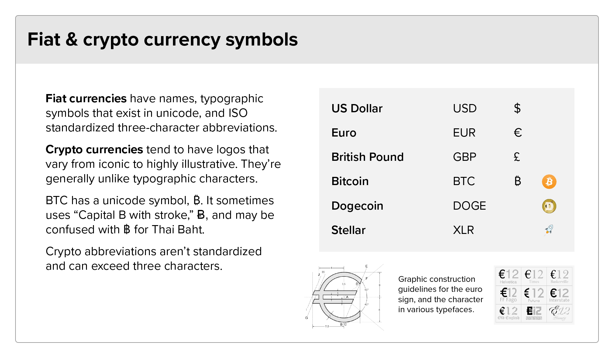
First off, what to call it? “US Dollar Coin,” “USD Coin,” and “USDC” were all thrown around with little distinction. All fiat currencies have an ISO-regulated, 3-letter code—think USD, EUR, GBP, and JPY. The world of blockchain adopted this to a point, and most crypto assets have a three letter code (BTC, ETH, ZEC). Still, crypto was born to break boundaries. Several assets used four, five, and even six character strings.
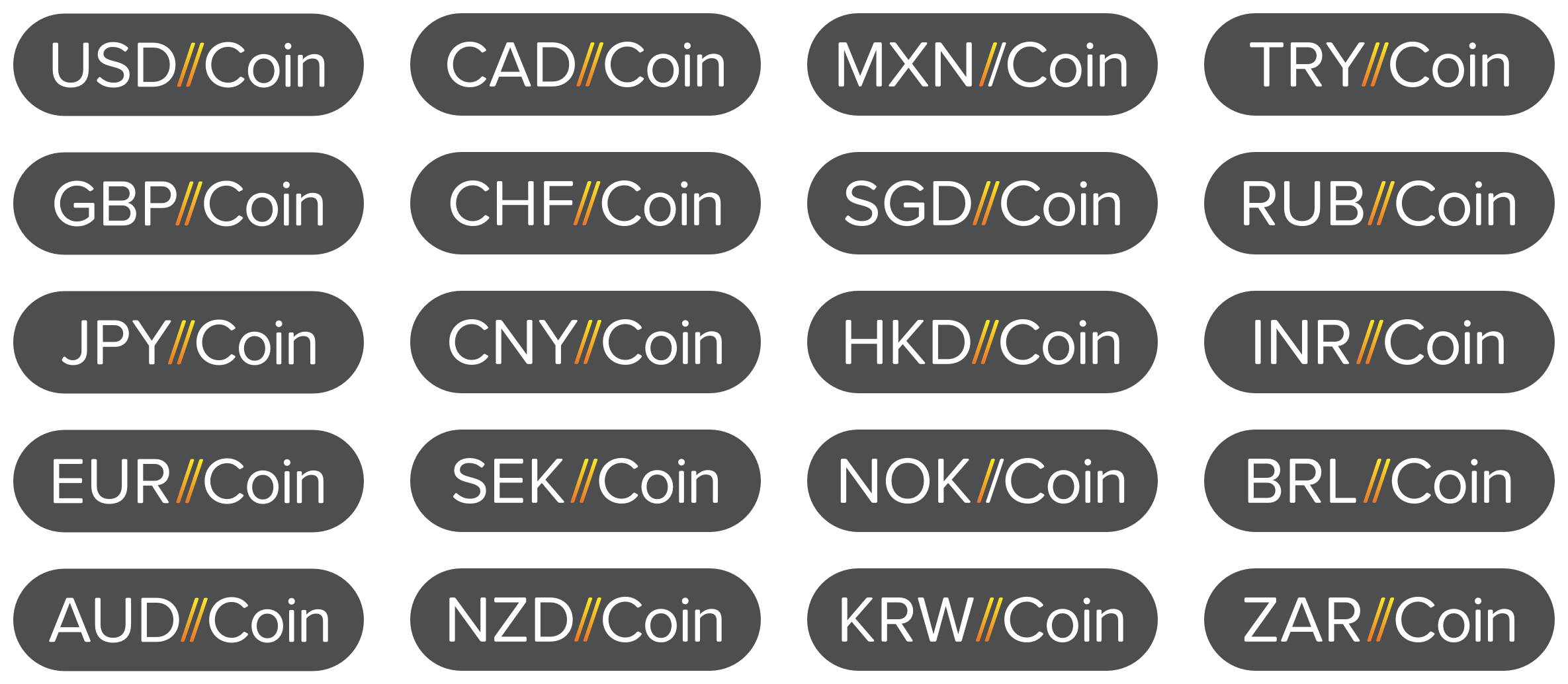
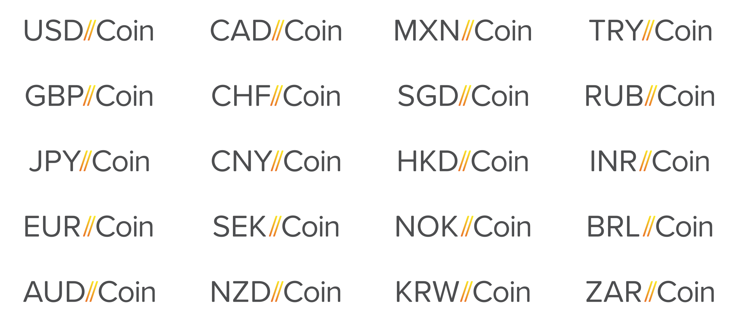
Because the technology behind USDC could enable other fiat-pegged stablecoins in the future, I felt that our system should scale gracefully. Imagine a world with USDC, EURC, GBPC, and JPYC, with each new coin building on that 3-character ISO standard.
I felt that we’d need a way to refer to and visualize that underlying technology—the “C” they all shared. We’d also need a branded collective noun—a simple word that would refer only to stablecoins based on CENTRE technology.
As for the visuals, I proposed that our system should feel at home alongside crypto assets and traditional fiat currencies. Crypto assets are effectively software projects, and thus USDC should have a full identity package, complete with logo, a color palette, and usage guidelines.
But I also imagined a logo that felt typographic, something that would fit in alongside currency characters like $, ¢, £, and €. I didn’t want to limit users to the acronym—after all, I can write the value of a Benjamin as $100 or 100 USD. Some crypto projects have directly co-opted existing Unicode characters. Early on, Bitcoin was often denoted with the phonetic symbol Ƀ, or more confusingly, ฿, the symbol for Thailand’s official currency, the Baht. I didn’t want to take this approach, but it’s not as though we could add a new character to Unicode and mandate that every type designer include a new glyph in their fonts. But what if the symbol could be constructed with some sort of combination of standard characters?
Lastly, though I wanted USDC to feel like a traditional fiat asset, I wanted to avoid confusion or legal risk. I avoided an approach based solely on the $ symbol in order to make it clear USDC was not an official US government currency. This would also avoid confusion with other currencies that share the $, such as the Australian and Canadian Dollars and the Mexican Peso.
U - S - D - Slash - Slash - C
After several rounds of exploration and feedback, we landed on the USD//C concept. The coin’s full name would be USD//Coin, abbreviated to USD//C.
Why the slashes? They’re parallel lines, reflecting the coin’s price parity with USD. The forward tilt represents the project’s forward-looking stance, bringing USD into the future. Because slashes are in just about every font, the name is infinitely typeable, no custom symbol required. Of course, the double slashes also evoke established open protocols (think http:// and ftps://), helping USD//C to feel instantly familiar.
//C can be easily appended to any ISO currency code, laying an obvious path for multi-currency expansion. When used on its own, //C could refer to the technology, as opposed to any single coin. I considered $//, $//C, and $C as possible shorthands, but as Ben Franklin would surely agree, “$//C100” looks bananas. The shorthand concept was dropped.
Excerpts from an internal deck produced during the project’s final stages
Ready for launch
On September 26, 2018, CENTRE announced USD//Coin to the world. Those slashes were all over CENTRE's website and the crypto press. We even created some fantastic merch for Circle employees.
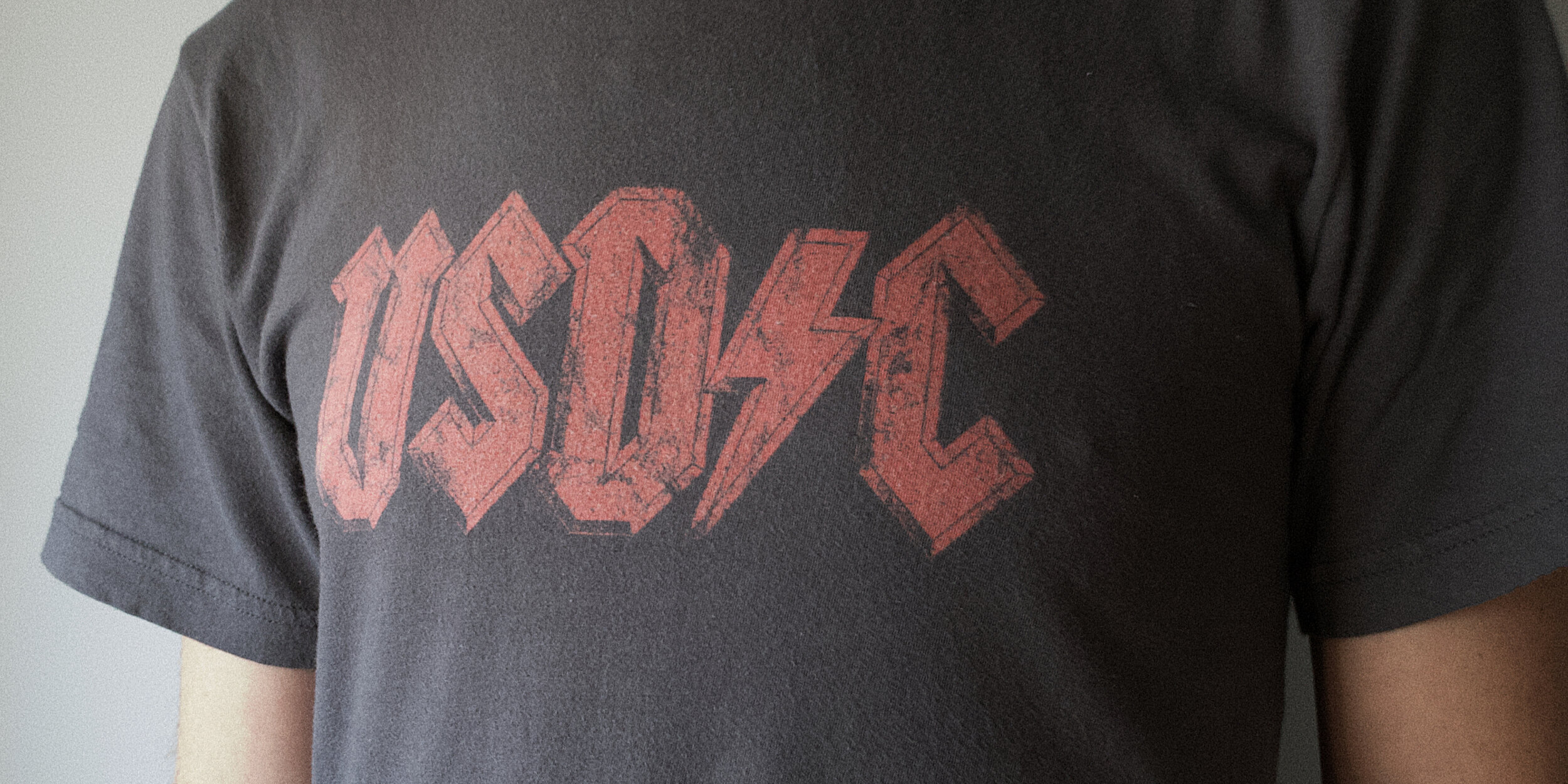
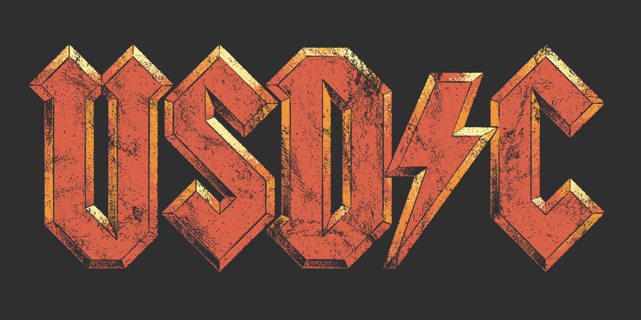
I illustrated an insane AD/DC-style logo, which was beautifully silk screened onto t-shirts by my friends at Earls of Inc. The Earls printed the crackly graphic in a desaturated hue on super soft American Apparel tees, creating the look and feel of a concert shirt you’ve worn thin over the years.
My original design was three-color, but alas, the cost was prohibitive.
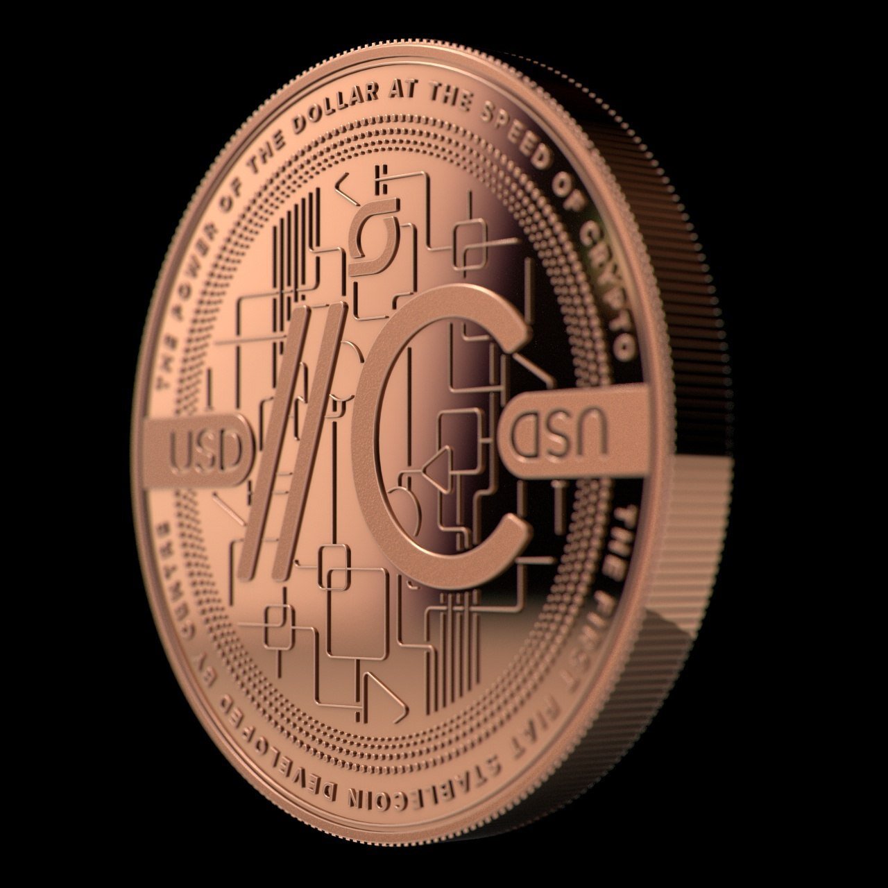
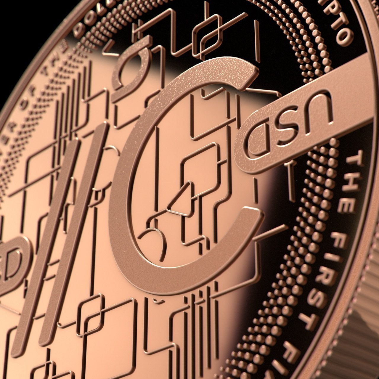
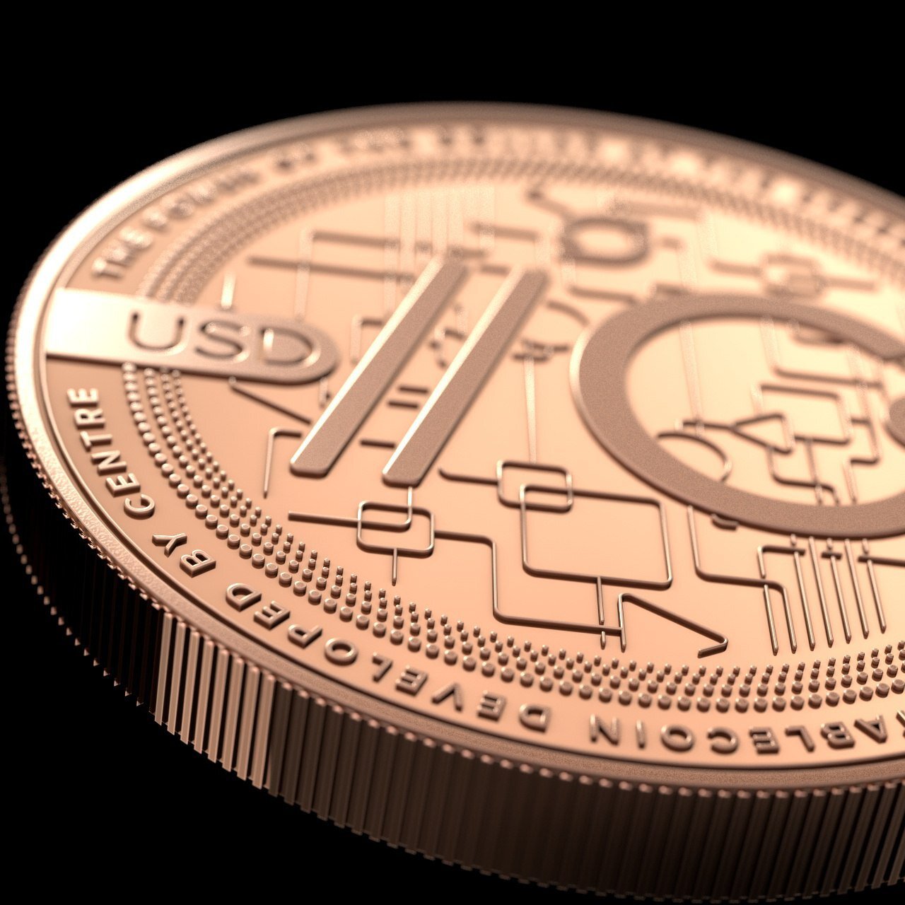
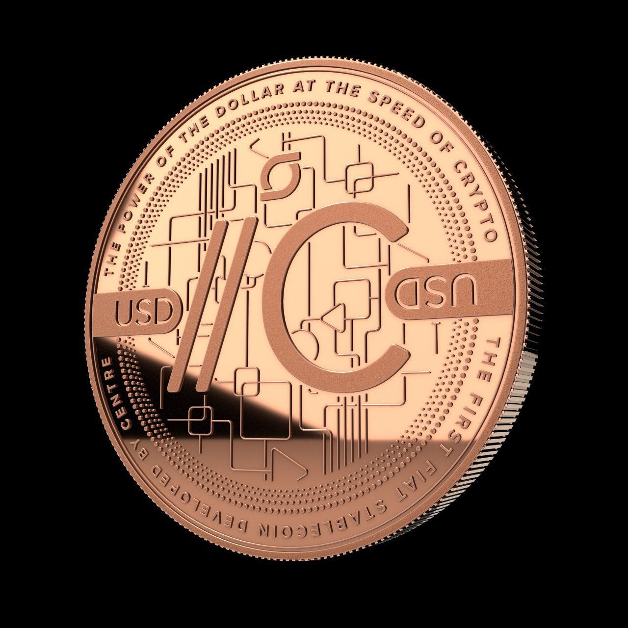
We even worked with a company that mints physical copper, silver, and gold coins as crypto hardware wallets. I collaborated with my colleague Kristine MacAulay to design the face of a coin, a limited run of which would be produced as mementos for key contributors to the project.
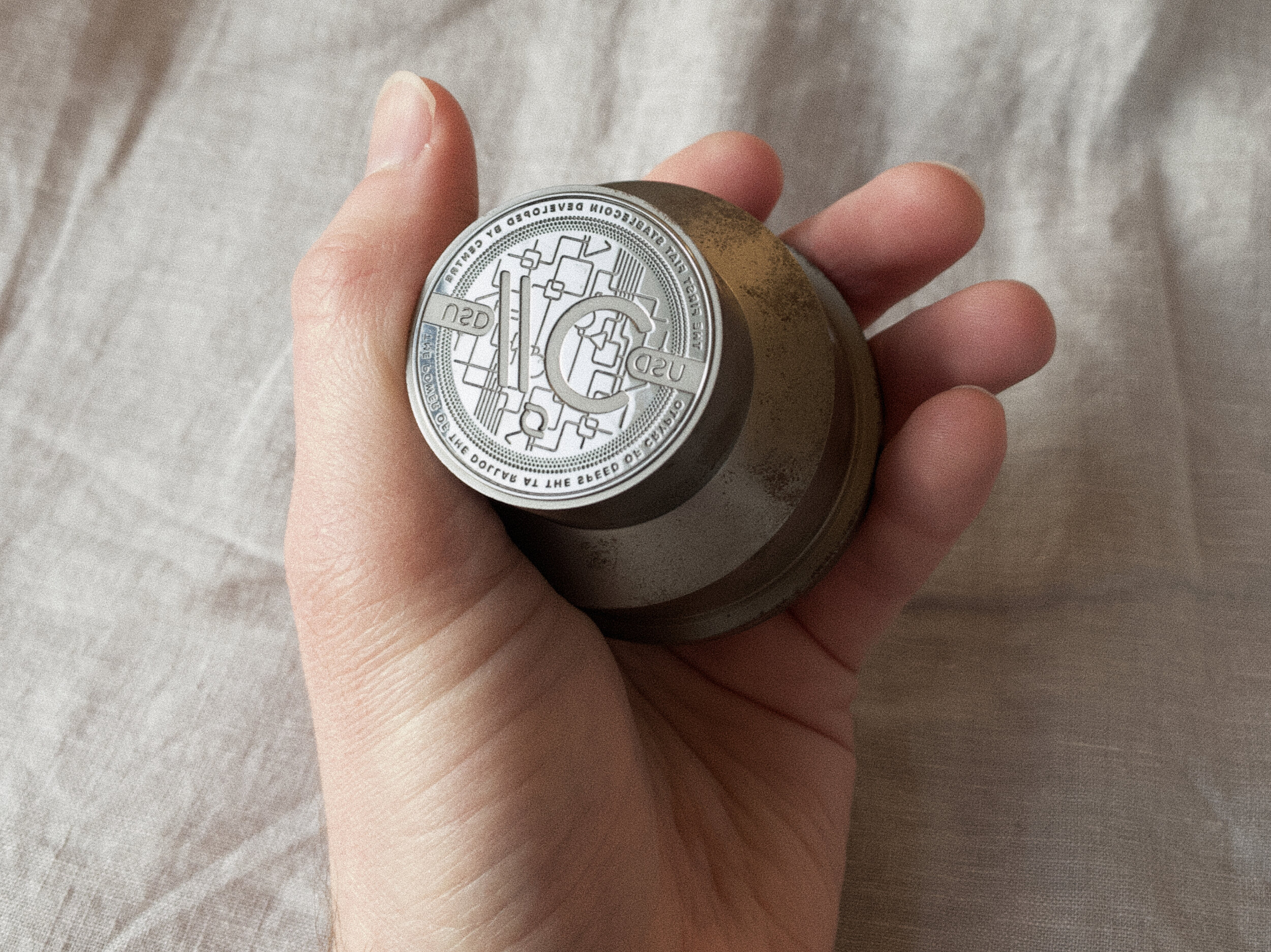
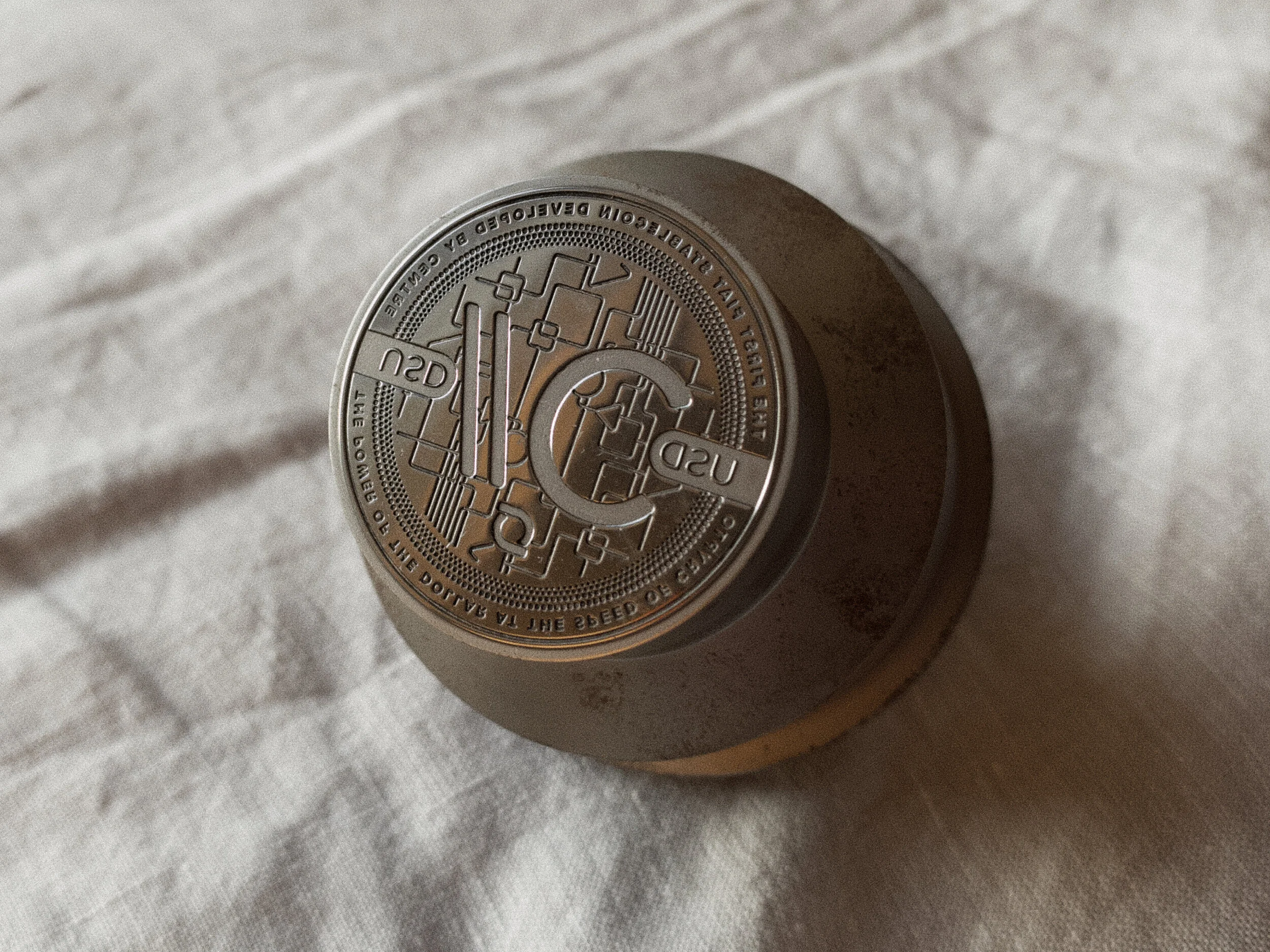
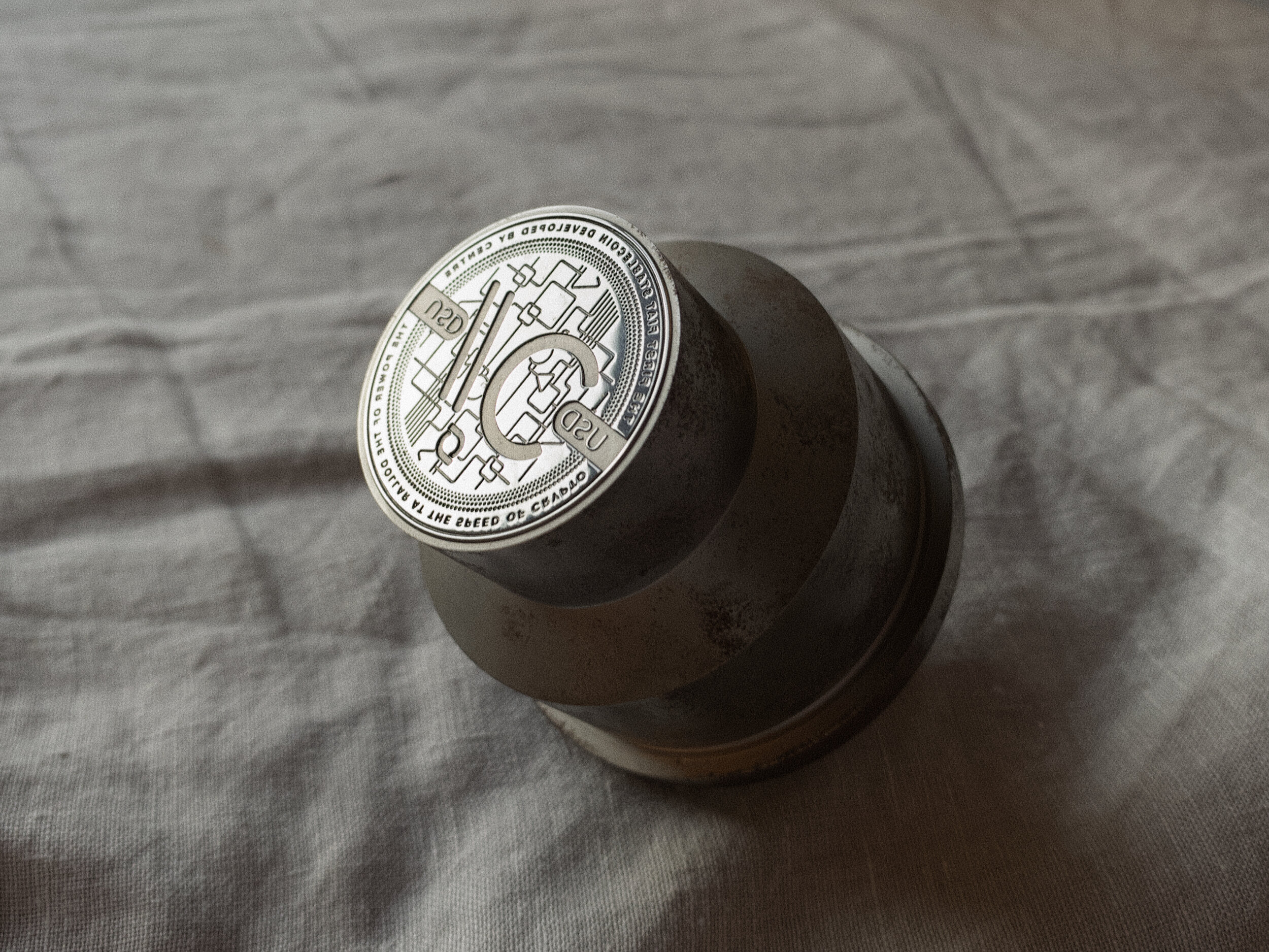
A die was cast and production was about to begin, when all of a sudden, we literally had to stop the presses.
The design of our physical USD//Coin, alongside 3D renders from Cold Storage Coins.
The slashes were slashed
CENTRE’s technological, philosophical, and creative roots may have started at Circle, but it was always intended to one day stand on its own. It would be a consortium, with industry leaders working together to create common standards, interoperable protocols, and open networks.
On October 23, 2018, that’s exactly what happened. Coinbase joined Circle to formally co-found the CENTRE consortium. In the final hours leading up to the announcement, there was a ton of back and forth, rife with the kind of polite tension one might expect in a partnership between competitors. There were press releases to write and rewrite, compromises to be made, and power poses to be struck.
The USD//C identity was a casualty, replaced by a new logo proposed by the Coinbase team. In hindsight, I can’t help but laugh at the remarkably petty back and forth our design teams had over USDC’s particular shade of blue and its curious proximity to Coinbase’s own primary brand color. 🙄
Though my ego was momentarily bruised, I have truly come to like the new logo. I admire the simplicity of the dollar sign encased in half-circles, which represent the stable crypto “wrappers” around fiat (and double as two C’s for Coinbase and Circle). Though I had been wary of using a "$," I should have seen that there was no risk of confusion in the target market (though the US Treasury might feel otherwise). Lastly, CENTRE has yet to create a fiat-backed stablecoin based on any other currency, proving my grand plan for a scalable suffix system too clever by half.
Memories
With the new logo in place, the hardware wallet project was picked up again. Kristine and I updated the design, a new die was cast, and collectible coins were produced.
It’s a great memento …
… but it’s not as cool as this!


