As a financial tech startup, Circle's apps have always needed to represent currency. Circle Pay got its start as a Bitcoin wallet, and within a couple years added US Dollars, British Pounds, and Euros. Custom icons were made for these four currencies, showing up throughout the app and its marketing.
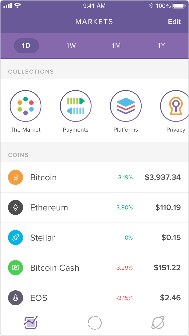
But Circle Invest called for even more. At launch, the app offered six different crypto assets, and within a year, thirteen! Presenting these disparate crypto projects in a coherent and consistent way would advance Invest's mission to make crypto more approachable. And so alongside my work crafting custom UI icons, spot graphics, and editorial illustrations, I also created a unified set of crypto icons.
The only rule is: there are no rules
Crypto doesn't exactly follow a strict set of rules. On the contrary, most are open-source software projects, maintained by a large, distributed group of individuals, often without a central guiding force or parent entity. As such, their level of brand sophistication varies wildly. Some have well-defined identity systems with official, downloadable logo assets, color palettes, and usage guidelines. Others are chaos.
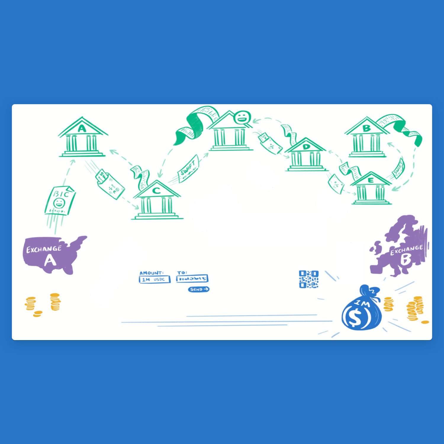
An animated GIF crafted by Circle’s brand creative team
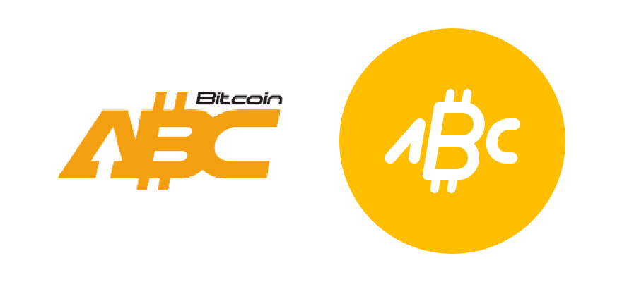
Some assets attempt to look like currency symbols, as though they'd appear in any font alongside $, €, £, and ¢. Some went so far as to co-opt existing Unicode characters. Before Bitcoin was formally added to Unicode in 2017, it was often denoted using the phonetic symbol Ƀ, or more confusingly, ฿, the symbol for Thailand's official currency, the Baht. Some asset symbols are more logo-like, while others (like Dogecoin and Decentraland's MANA) are effectively full-blown illustrations.
I set out to craft a cohesive set that brought all the logos closer to the "currency symbol" end of the spectrum. The challenge, of course, was balancing consistency with faithfulness to the originals.
The icons sit within a 24 × 24px frame and are constructed with a 2px stroke with rounded corners terminals (though in some cases, a finer line was needed to capture the spirit of a logo). These are the same parameters as my "UI Icons" library, ensuring the crypto icons felt at home in Circle's apps. I also produced larger versions for the "Illustrated Icons" library, which were used heavily in Invest's brand and marketing.
Social graphic for Circle’s “Bitcoin bonanza” promotion, featuring my library of crypto asset icons
And I didn't stop at the assets already listed in Invest. For legal and security reasons, the knowledge of which assets we'll offer is closely held until shortly before launch. I didn't want to be caught flat-footed, having to turn around a handful of icons on short notice. In addition, I anticipated that we'd eventually bring the icons to Poloniex, which lists dozens and dozens of assets! I set out to build each and every one.
Color
Each asset was also assigned a key color, which sometimes proved even harder than the icon work! While most assets have some form of symbol or logo, official colors are rare. When no guidelines were found, I'd choose a dominant color from the project’s website. I ensured that each would be unique, with no two assets in our set using the exact same color.
The hues were also chosen with contrast in mind. We wanted to ensure that each icon, rendered in white, would stand out against its key color. We applied the same strict accessibility standard we use on text color, but ran into trouble with lighter asset colors. Shifting dark enough to pass text contrast standards transformed them beyond recognition. This was especially troublesome for Bitcoin, the oldest and most widely-known cryptocurrency. Turning its distinct orange to a rusty brown was unacceptable.
In the end, we applied a less stringent standard. The W3C's visual contrast guidelines specifically exempt logos and logotype:
Stylized text, such as in corporate logos, should be treated in terms of its function on the page, which may or may not warrant including the content in the text alternative.
We never use an icon and color as the sole method of identifying an asset. They are additive, always presented alongside the asset’s name and currency code. Sacrificing contrast for brand precision, in this instance, felt like the appropriate tradeoff.
Always more icons
This project has advanced slowly and sporadically, often in the gaps between more immediate priorities. But with new wallet designs coming soon to the Poloniex web and native apps, the icons are off the back burner. The library is nearly complete—for now, anyway! With new assets being developed and listed all the time, the work is never done.

