In 2015, Fresh Tilled Soil celebrated its tenth anniversary. To set the course for the next ten years, I proposed that we revisit the company’s branding and identity. With most of our energy focused on clients, our own marketing collateral and website updates were squeezed into the margins, and the identity lacked a cohesive visual system. Leadership agreed, and soon Fresh Tilled Soil itself became my sole client. I led the rebranding process and received invaluable support from Chris Wilcox, Steve Hickey, Michael Perrone, and Trish Dallmeyer.
Redefining the brand
To refine our brand, we employed the same processes and exercises we used with our clients. We mapped out the experiences and needs of our customers, as well as our role in the local design community. Here are some of the core themes we identified:
The Richard Show was in full effect on Fresh Tilled Soil's mid-2012 website (snagged via archive.org)
The Value of the Team
As a young company, Fresh Tilled Soil's website led with a big photo of its Co-Founder and CEO, Richard Banfield. It made sense: he’s a brilliant leader, a charismatic mascot, and a major player in Boston’s technology and entrepreneurship community. Today, however, Fresh Tilled Soil is full of published authors, public speakers, educators, and world-famous podcasters, all well-regarded in their own right. It was time to retire what we affectionately called “The Richard Show” and rebuild our brand around the entire team.
Balance
Fresh Tilled Soil’s culture and creativity stems from its comfort with dichotomy. The ability to “hold two opposed ideas in the mind at the same time"enables the relentless pursuit of great design.
Fresh Tilled Soil applies timeless design principles to modern technology solutions. We balance our client’s business needs and their users’ needs. We rely upon trusted processes and best practices, but apply them flexibly, as each project is unique. We are confident in our expertise, but humble enough to see where our knowledge ends and when it’s time to listen. We are sophisticated, delivering high-quality work to high-end clients, but we are always warm, welcoming, and human.
A Transformative Partnership
Each client engagement is a deep partnership, a thrilling balance of risk and reward, and an immensely transformative process. “The navigator” is a (cheesy) metaphor we conceived to illustrate that experience.
Every client starts on safe, familiar ground, but is suddenly pushed to the sea (perhaps a competitor is nipping at their heels). They’ve hired us to guide them to a promising but uncertain destination. We’ve never crossed this particular sea, but we’ve formed expertise over hundreds of previous expeditions. We’ll lead them to success, but should the worst happen, we’ll go down with them. Should we succeed, they’ll be wholly transformed—not just from the achievement, but also from learning some of our methodology along the way. After working with us, they’ll be better equipped to take on the next challenge themselves.
The Final Form
The Logomark & Logotype
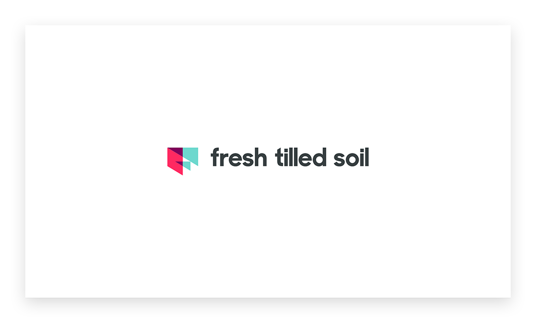
The logomark is a bold capital “F” formed by three simple shapes. The geometry suggests a bright and modern heraldic shield, a banner for the Fresh Tilled Soil clan. The form also evokes a guild’s emblem, grounding the company’s work in traditional craft. One triangle leads another upward and to the right, a navigator guiding to success. The shield’s full outline is merely inferred, a nod to the discovery and frontier inherent to the work. A linear alternate was created for use in monochrome environments.
The logotype is set in Lucas Sharp’s Sharp Sans No1 Bold, a geometric sans-serif that handily references multiple eras of 20th century type design. I made a few subtle tweaks, such as opening up the e’s aperture and aligning diagonal terminals to the logomark’s geometry.
Color
The colors—teal, magenta, and a rich purple created through transparent overlay—are reminiscent of both 3D glasses and the ruby red “decoders” used in kids games and puzzles. These concepts speak to the transformative power of perspective, how a new lens can reveal undiscovered potential.
The vibrant primaries are applied sparingly outside of the logo. Fresh Tilled Soil is a boutique, high-end firm. The brand balances brash creativity with poised sophistication. We made a rule that collateral would lead with photography, images of our work, and text rendered in subtly chromatic grayscale, all set against ample white space.
Typography
Sharp Sans is used in the logo only. We chose Mark Simonson’s versatile Proxima Nova predominantly for body copy. For headlines, we enlisted Clarendon Text, Canada Type’s highly legible and well-balanced take on mid-century Clarendon revivals. Lastly, Trish discovered Galaxie Copernicus from Constellation, an extraordinary choice for big, bold pull quotes. The resulting system is clean, highly adaptable, and steeped in classic design ideals.
Bringing it to life
Creating an identity system’s raw materials is just the beginning. Before I left Fresh Tilled Soil, I helped create a Keynote template, event signage, business cards, and more. There is so much potential waiting to be unlocked, and I’m excited to see how my former colleagues apply, adapt, and expand my design system in the future.
Business cards, expertly printed by Studio On Fire in Minneapolis. They're letterpressed, duplexed, and edge-painted.
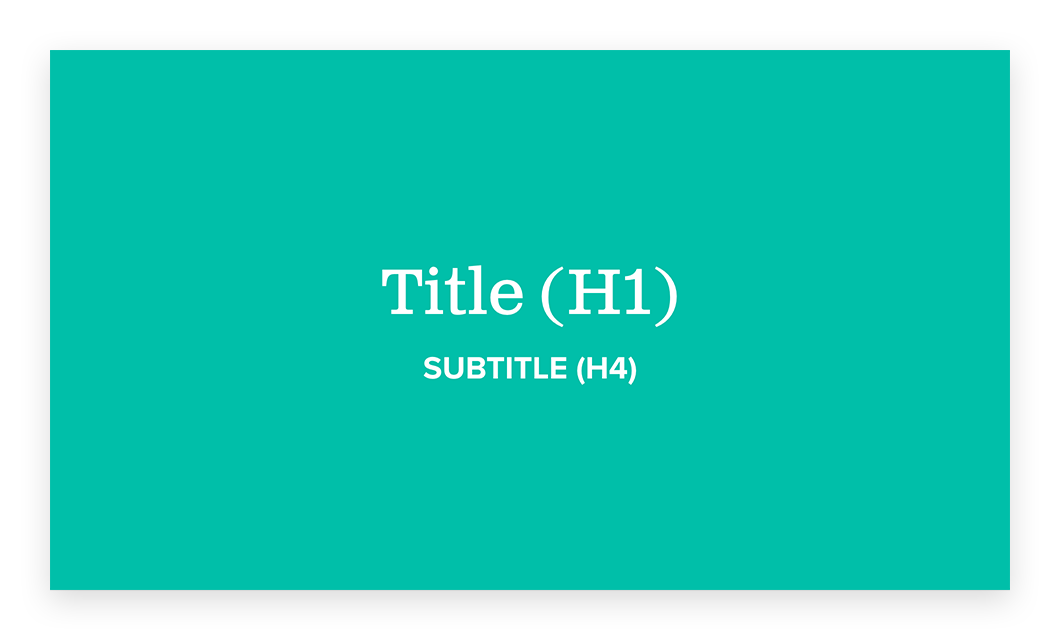
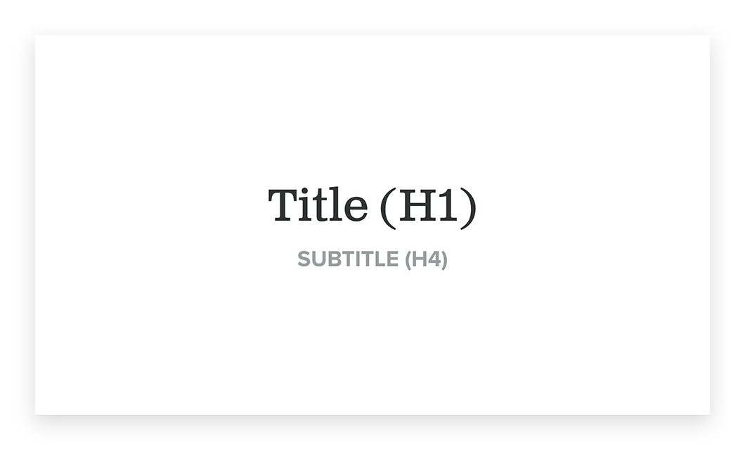
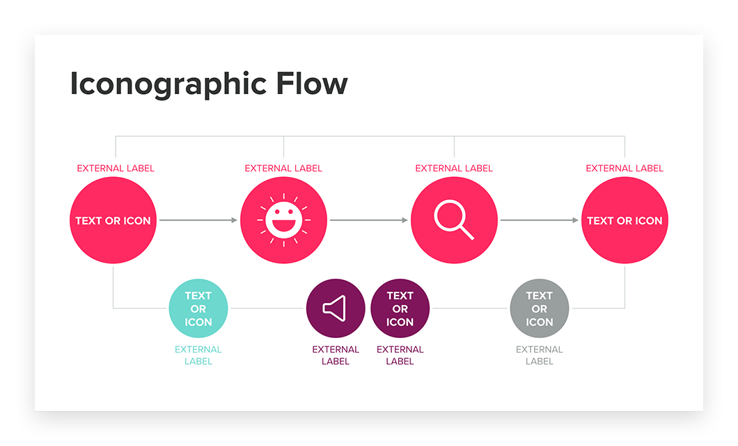
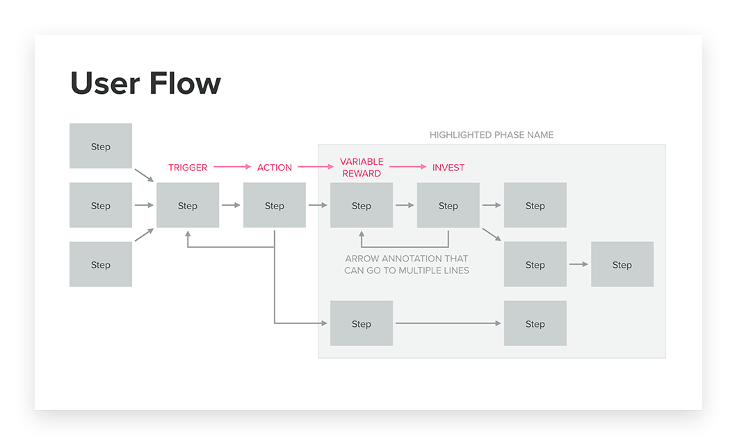
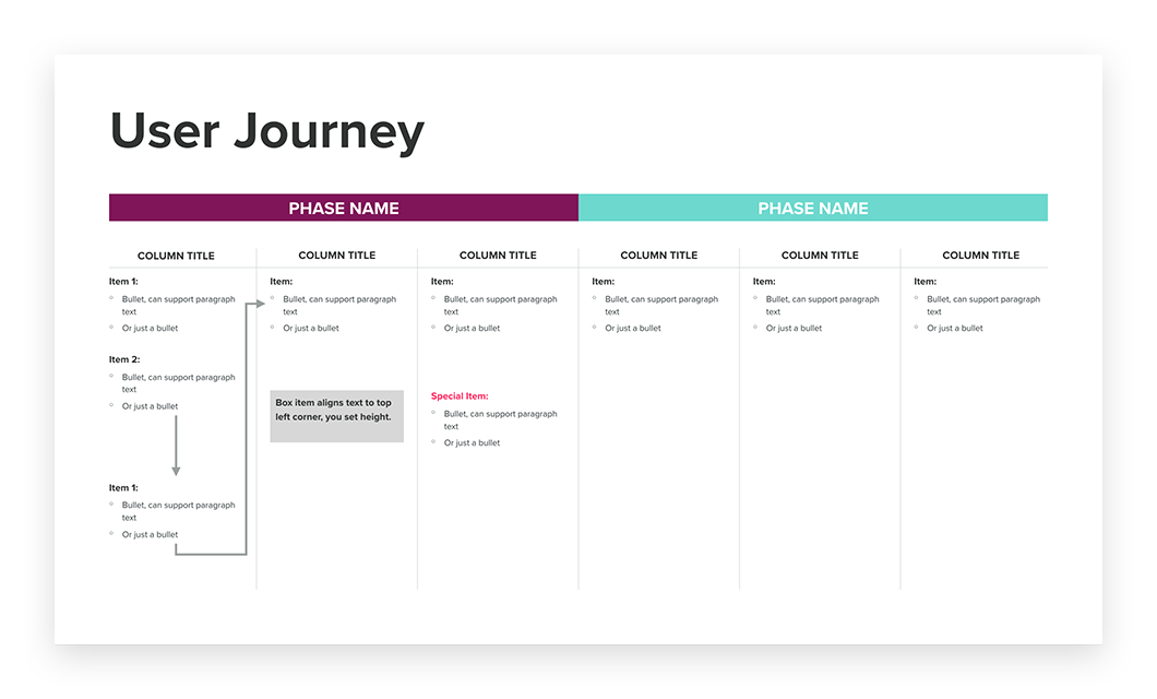
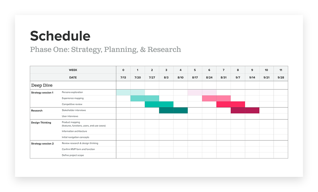
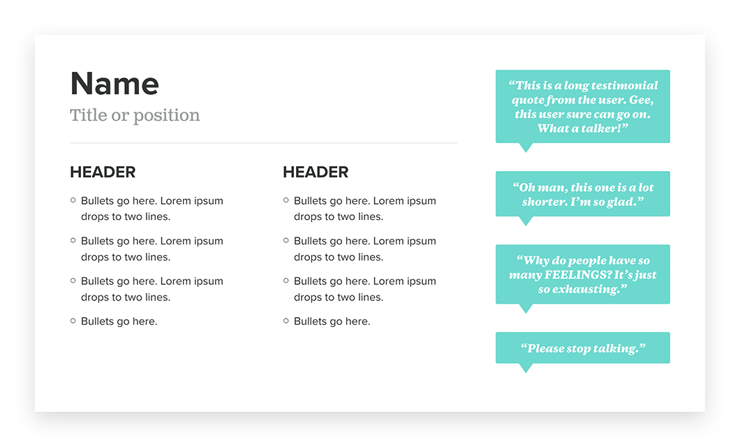
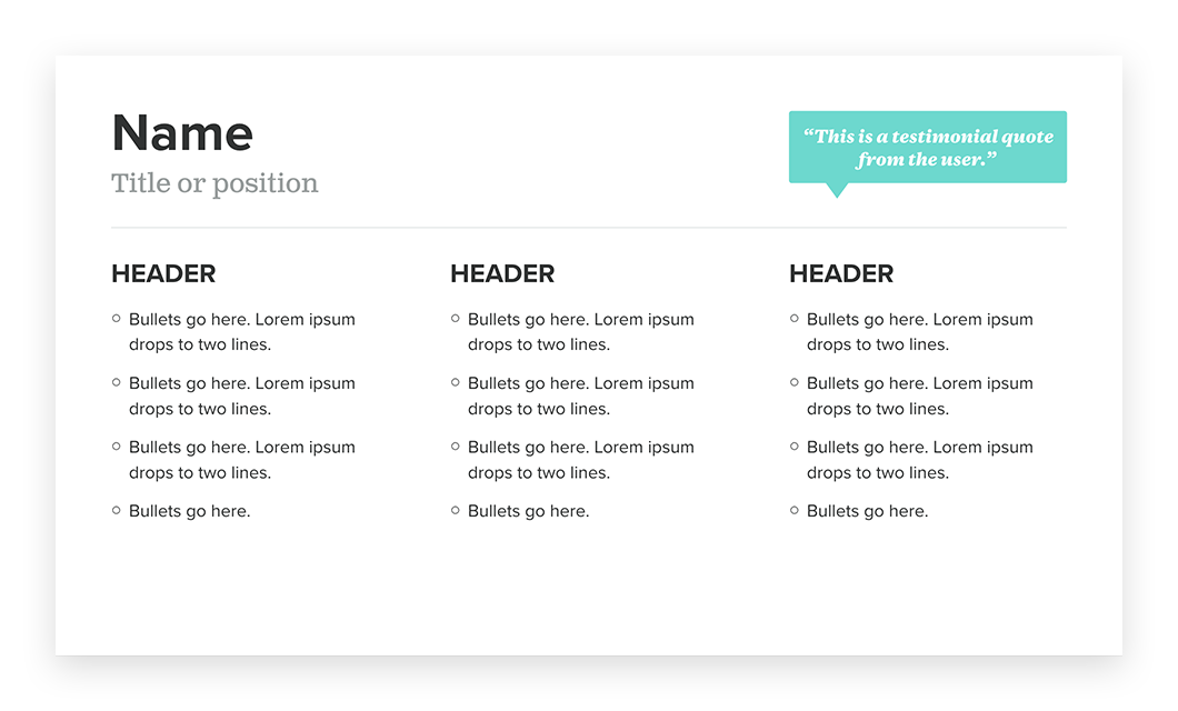
Selections from a Keynote starter kit with 50+ slide templates
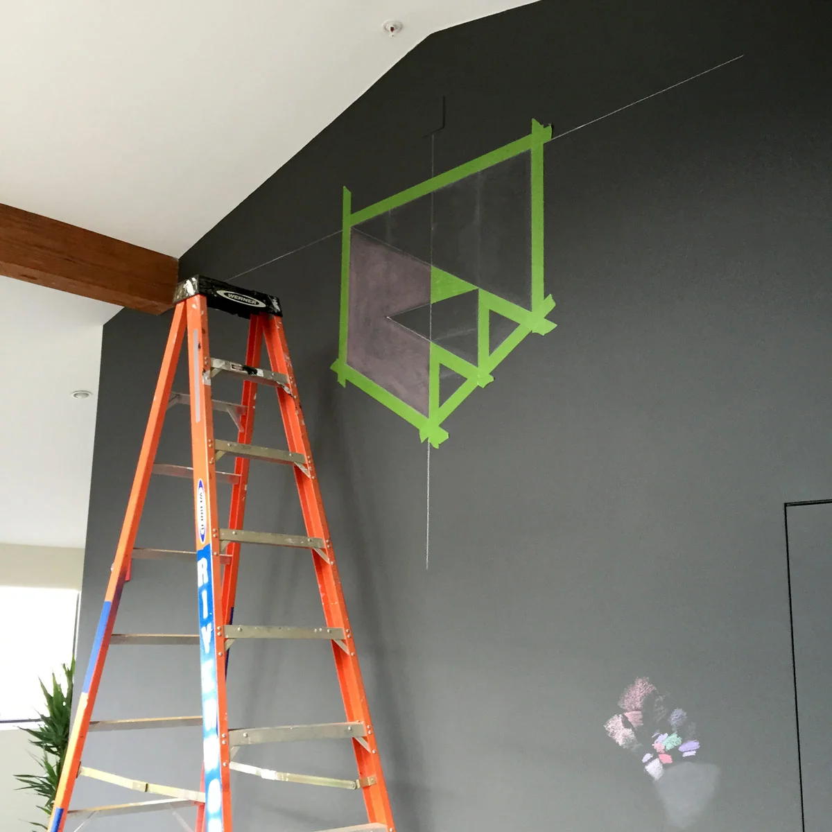
An update to the office's chalk mural
The logomark's geometric structure, for use in patterns, custom icons, etc.
The beginnings of a UI kit
A custom version of the logo to celebrate marriage equality


