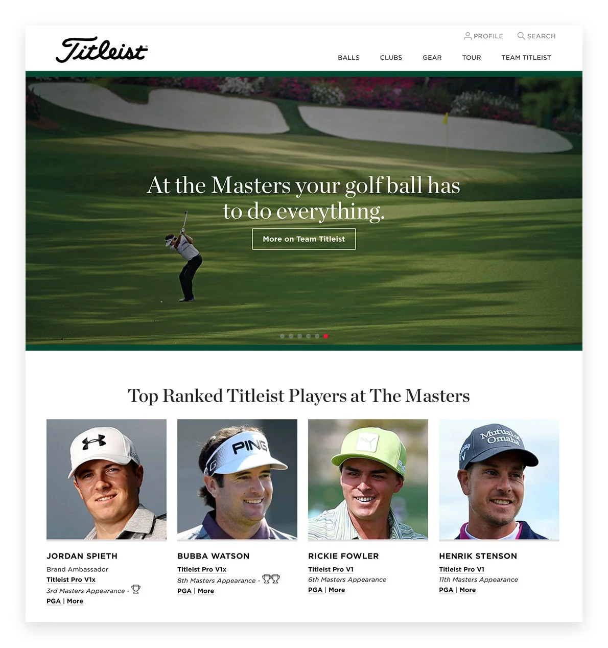
For more than 80 years, Titleist has made “the #1 ball in golf.” The storied company came to Fresh Tilled Soil with a website that had grown too cumbersome; it was inflexible, mobile unfriendly, and in need of a visual and UX overhaul. Our team set out to craft a modern, fully responsive site that captured the brand’s timeless classicism.
I was joined on this project by some of Fresh Tilled Soil’s most senior talent: Senior UI Designer & Strategist Alex Sylvia, Executive Creative Director Michael Connors, Development Director Tim Wright, and Director of Client Partnership Tim Lupo.
The Titleist Brand
Titleist is a high-end brand. Their equipment is used by the world’s top professionals, giving the brand an aspirational quality. Buying Titleist clubs involves a one-on-one session with a trained fitter, not unlike the experience of buying a fine suit. The brand embodies a balance between the refinement of luxury with the tactile practicality of athletics. Extraordinary technology wrapped in fine leather.
How would we bring this story to life on the web? This was my first task on the project, to envision the site’s aesthetic and tone. I researched brands and online experiences that struck similar chords, drawing inspiration from luxury automobiles, high fidelity audio equipment, leather goods, and lifestyle magazines.
Lots of open space, sophisticated typography, sparse color, and a steady geometric rhythm would draw attention to rich photography of Titleist products and golfers in action. My early drafts of the look quickly evolved through collaboration with my fellow designers. Alex brought the final vision to life with a tight, cohesive design system that spans dozens of modules and countless pages.
Navigation & Structure

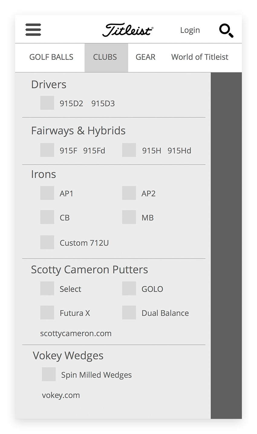
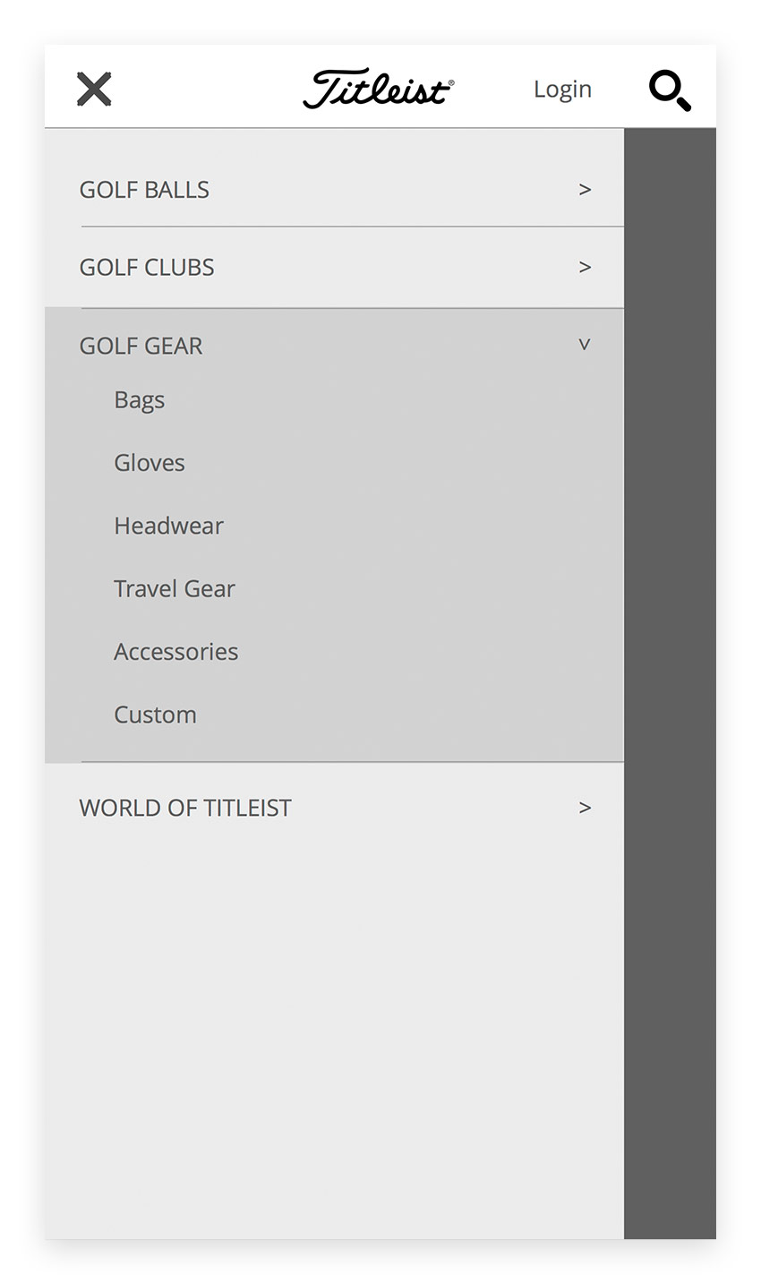
Michael, Tim, and I worked closely to define the information architecture and prototype ideal navigation systems. The site contained a lot of content and subsections, and we wanted to minimize the interaction required to explore the large hierarchy.
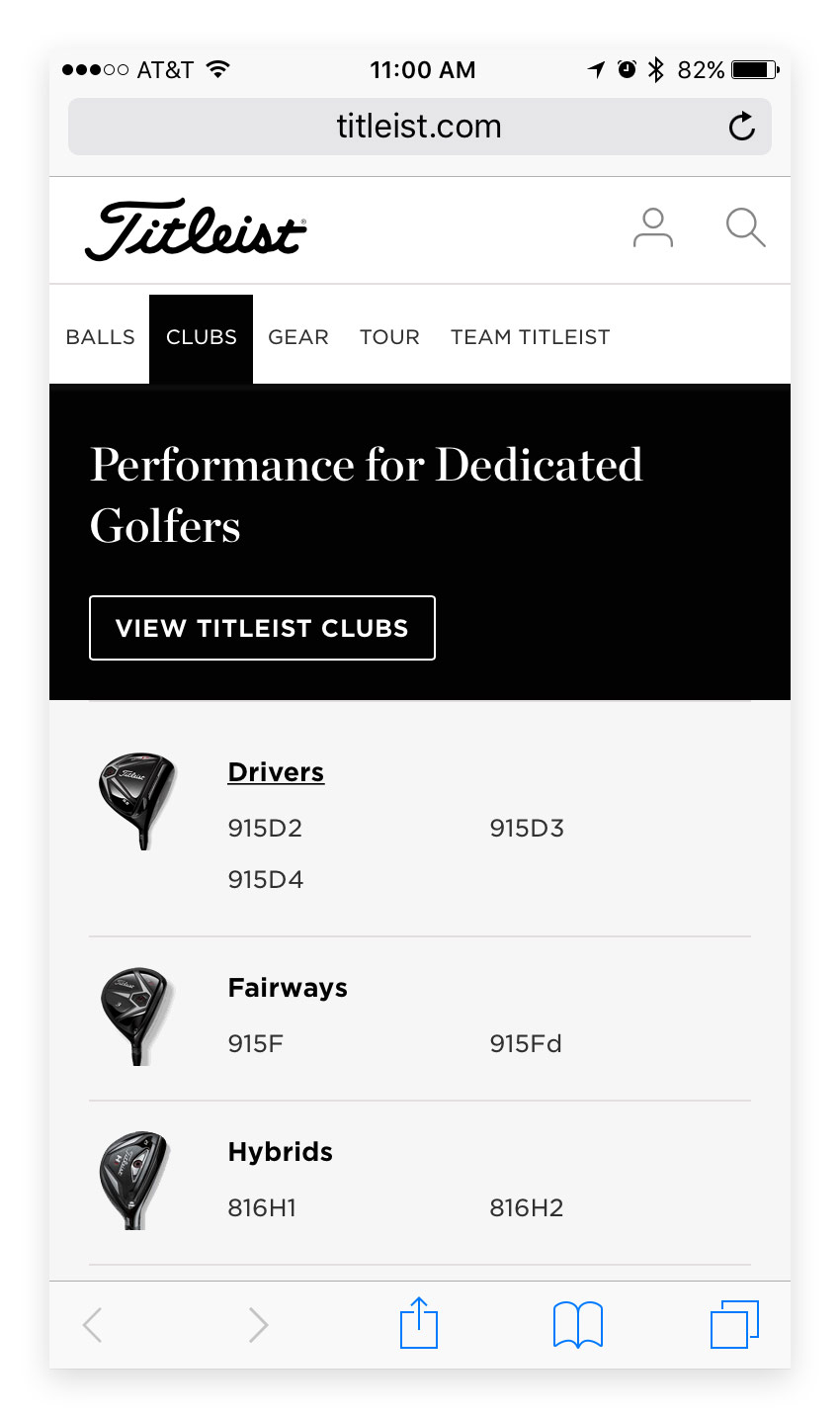
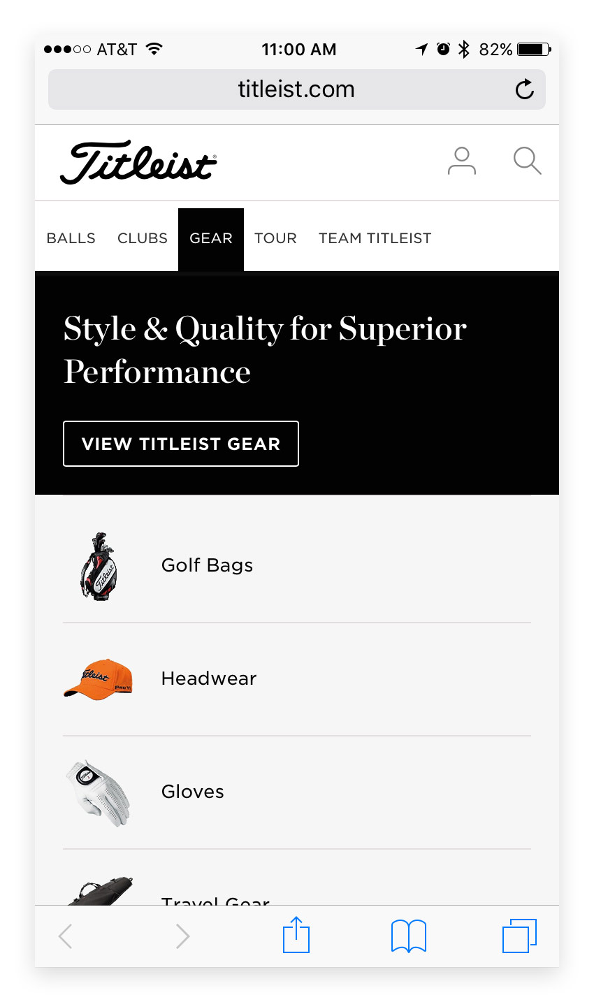
We landed on a primary navigation with five categories that remains visible at all screen sizes—no hamburger required. The navigation expands into a mega menu, with each subsection optimized for its respective content. For example, all product menus feature images to ensure quick visual comprehension. The images are highly optimized to reduce performance impact.
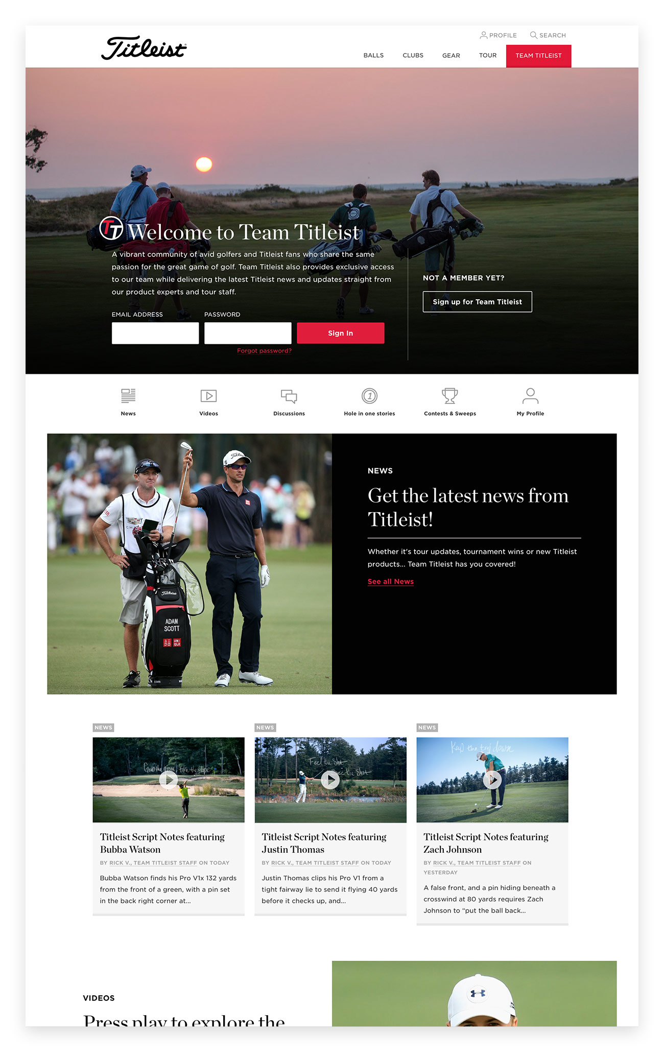
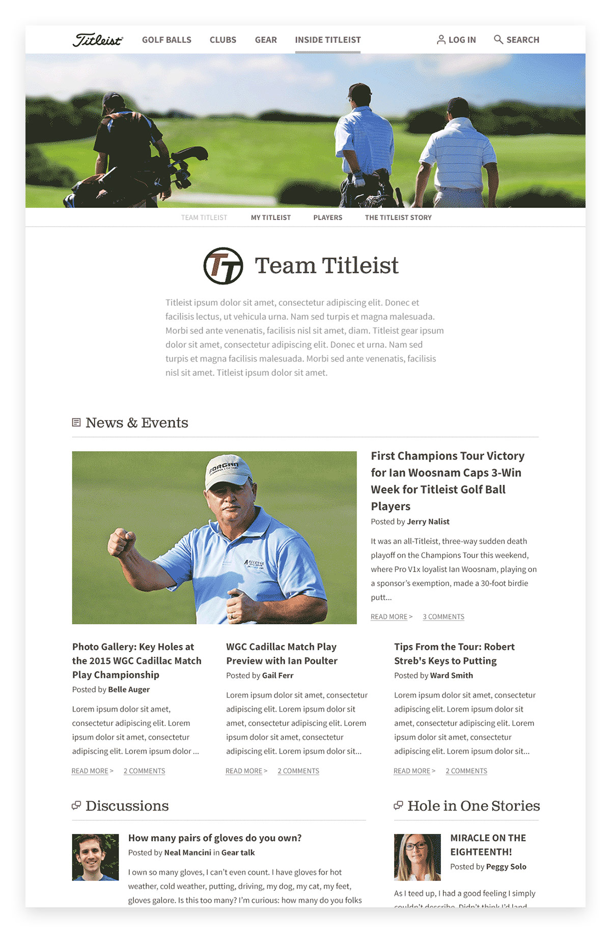
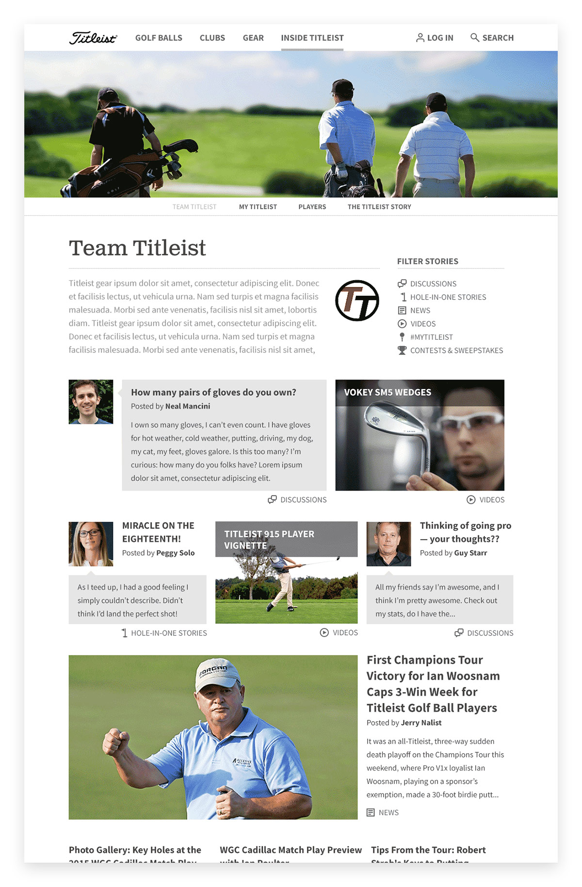
Team Titleist
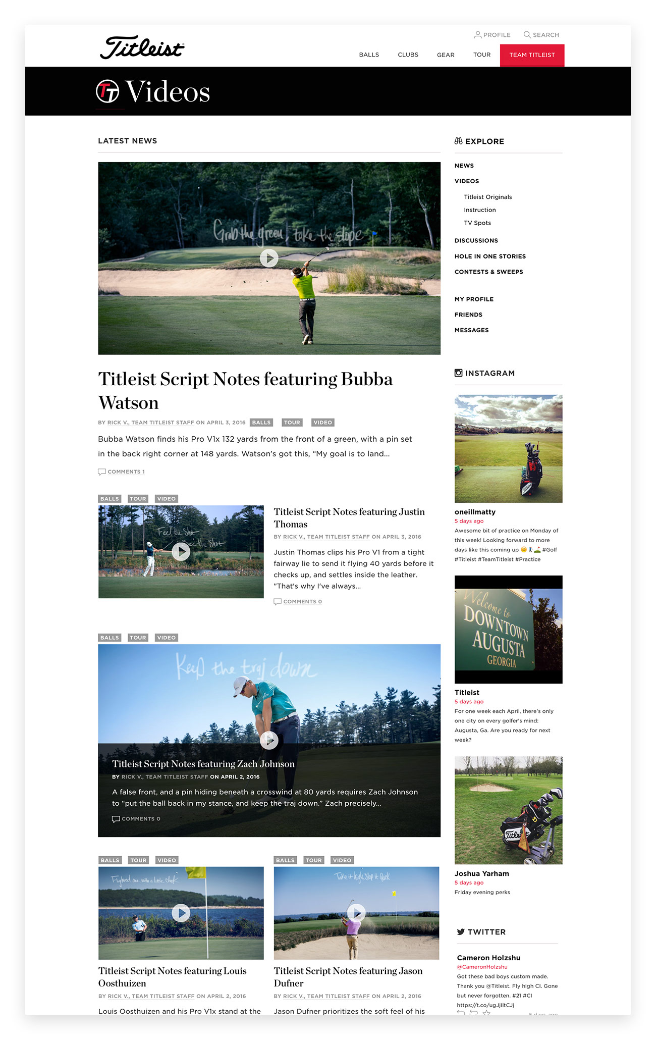
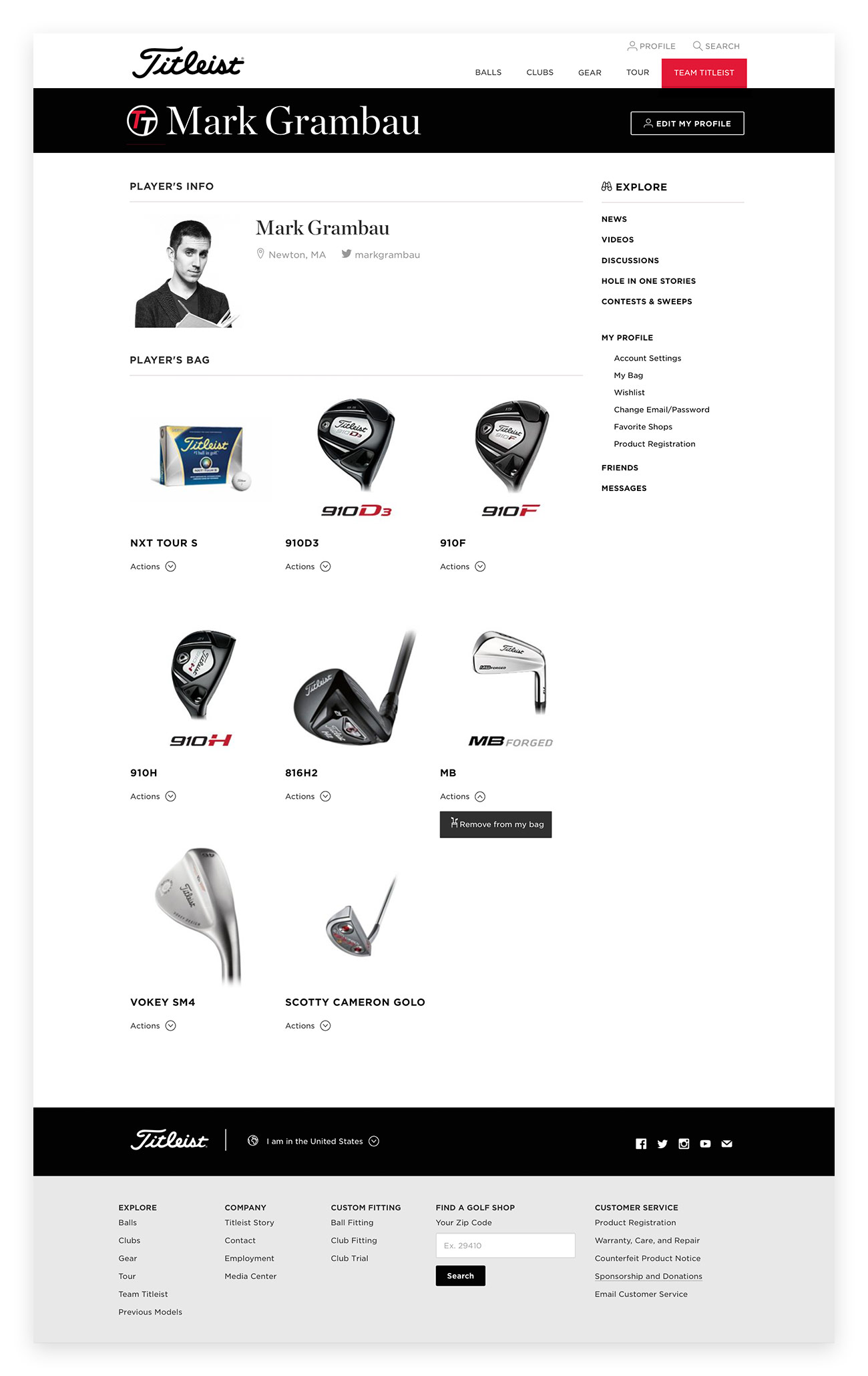
With the foundation laid, my attention turned to Team Titleist, a section of the site dedicated to fans and customers. It combined news, videos, and contests with social features such as discussion forums and personal profiles. Data and user interviews revealed that fans were deeply engaged with Team Titleist: asking each other questions, discussing the game, sharing personal achievements, and showing off their equipment.
Many brands struggle to build a vibrant customer community on their own turf (as opposed to a third party forum), but Titleist had found some success. We knew better than to try and fix what wasn’t broken. Our goal, instead, was to optimize: improve the mobile experience, refine awkward user flows, etc.
We fashioned Team Titleist as a sort of clubhouse-meets-lifestyle magazine for Titleist loyalists. While the rest of the site’s photography is heavily product focused—lots of equipment closeups—Team Titleist is about people and experience, with players set against beautiful landscapes that are so prevalent in the sport. It mixes professional news and videos from Titleist with user-generated content, putting scratch golfers right beside the pros they idolize. They’re at the club with Jordan Spieth, sharing stories over drinks with the world’s top player.
The profile pages and flows were dramatically simplified. On the old site, editing your profile involved confusing and often redundant pages. We winnowed the myriad of personal info fields to just those that were directly relevant to users. This involved eliminating fields whose sole purpose was their potential marketing value, but were underused and irrelevant to end users. We suggested that this data would be more appropriate in the form of short surveys or questionnaires. The result was a cleaner, simpler experience focused on the user's interests and needs.
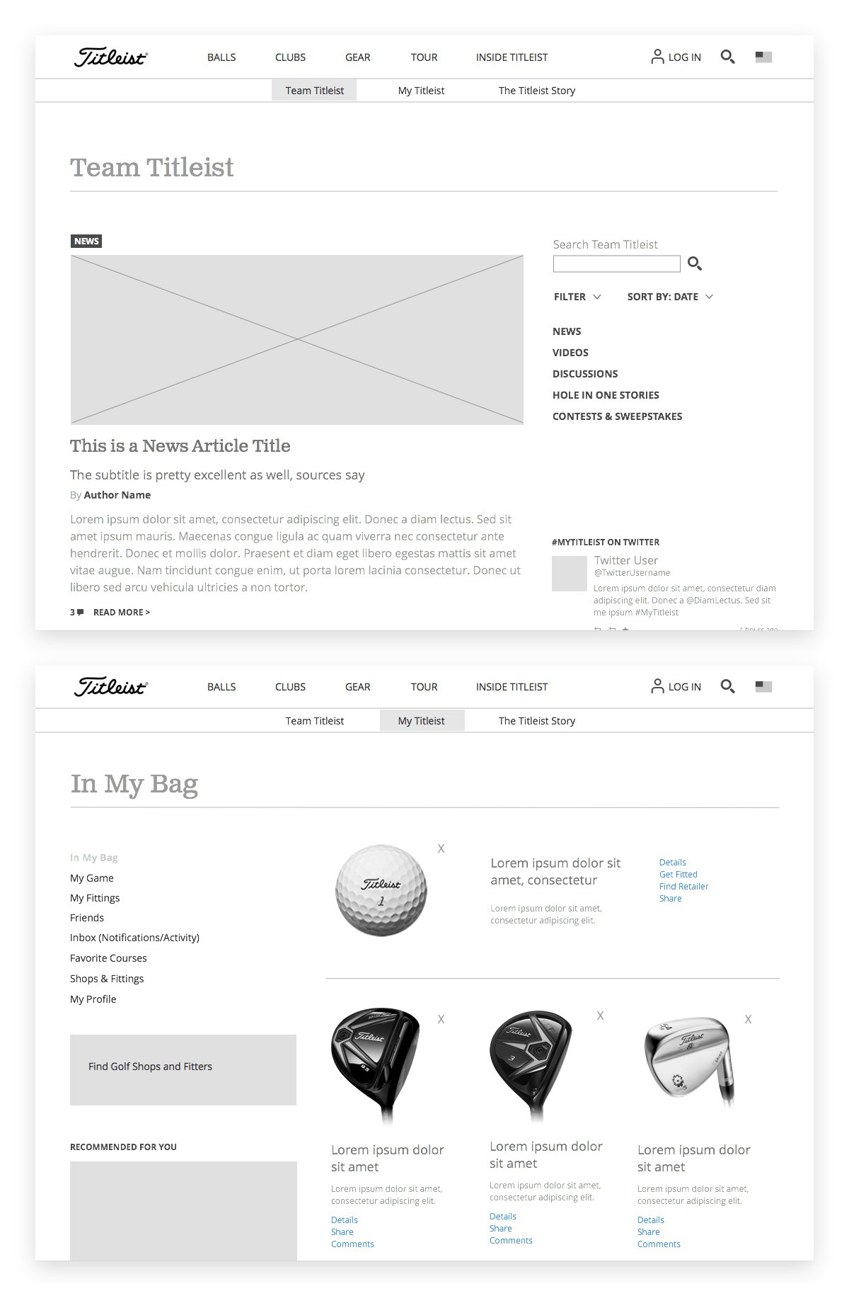
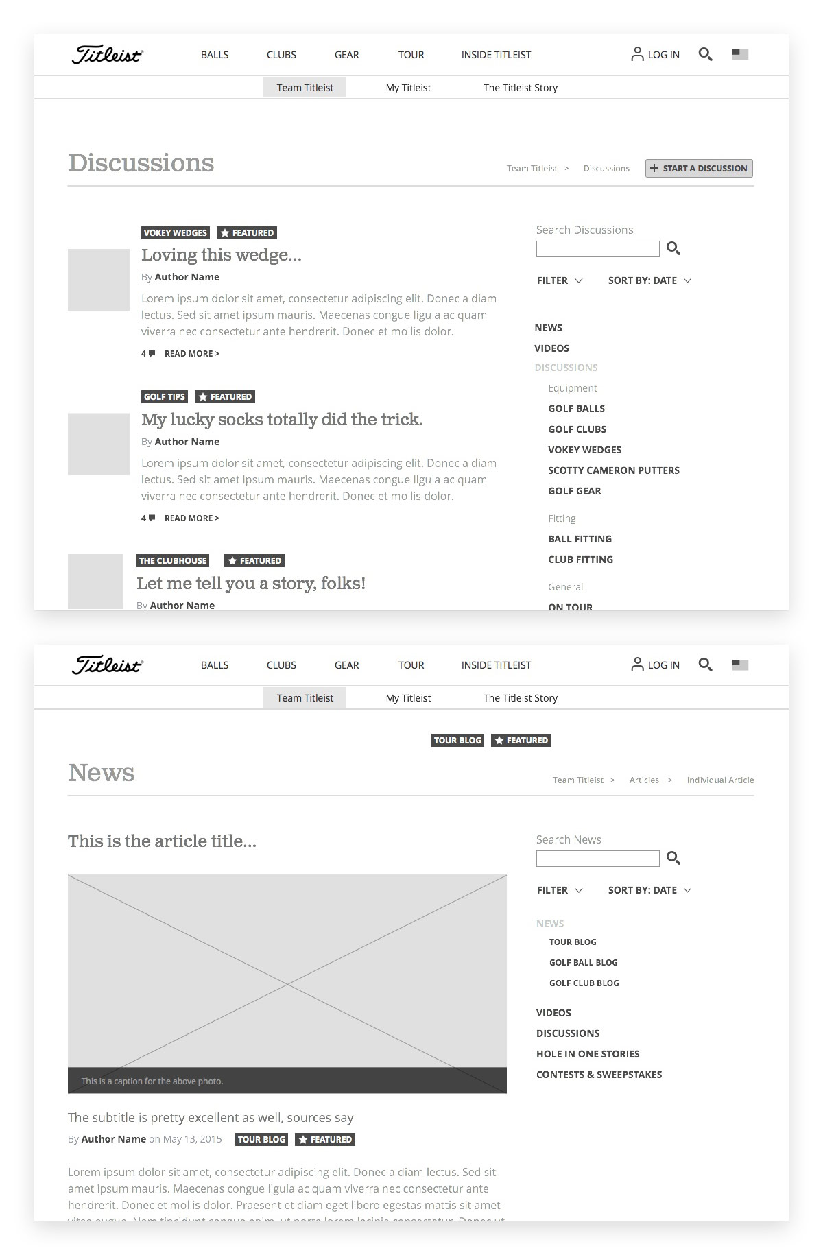
Team Titleist wireframes and design explorations
Icons
My final (and favorite) task was to create an icon set. We initially planned to utilize Jory Raphael’s wonderful Symbolicons set, but a few icons didn’t fit the brand, and the set’s sizing scaled poorly in our site design. I started making a few visual tweaks, but was soon redrawing every icon for a new grid size. Before long, we had a whole new set—a few altered Symbolicons paired with dozens of originals.

I’m particularly fond of these four fully original icons that failed to make the final cut. I want to ride around in this little golf cart all day!

18th Hole
The new site, which went live in early 2016, directly mirrors Titleist’s own equipment: fast, powered by modern technology, and informed by classical design principles. It was one of my best project experiences to date, thanks to the tireless efforts of my colleagues at Fresh Tilled Soil and our clients at Titleist.