If a single image summarizes the smartphone era, it’s a sea of down turned heads, dozens lost in the glow of their devices. Mobile technology is a marvelous vehicle for escapism, but Nick Napp and his team at MoveableCode thought we were escaping to the wrong world. They saw an opportunity: technology could enable new directions in storytelling and gaming, using the virtual to connect us with our physical world like never before.

MoveableCode was developing Incantor, a location-based fantasy game that brings magic to life. They came to Fresh Tilled Soil with extraordinary enthusiasm and an exhaustive rulebook of game mechanics, but only an early prototype with a rudimentary user interface. My colleague Steve Hickey and I refined Incantor’s mythology and mechanics, defined the app’s user flows, and designed its UI and visual language. Nick’s development team took our insights and design work and created a more sophisticated prototype to entice investors.
The story
Our first step was to dive head on into Incantor’s mythology. The story begins with five distant realms, revealed to humanity for the first time through sudden dimensional rifts. These realms had been at war for eons, with powerful beings called Incantors harnessing their dimension’s unique energy to battle. As the energies reached our world, the Incantors sent along mythical wands, so that we could learn to master the power just as they did. Suddenly, our modern world was illuminated by magic and wizardry.
The alien energy had a unique electromagnetic signature, to which our mobile phones proved remarkably sensitive. Through new software developed by the first humans to discover the rifts, we could use our phones to sense and analyze the energy all around us. We could sense magical artifacts, detect creatures from beyond the rifts, or challenge fellow humans who had allied with Incantors from opposing realms.
User behavior
Our first objective was to identify and understand potential users. MoveableCode’s goal was to target underserved “mid-core” gamers, an audience that’s unsatisfied with casual games like Candy Crush, but doesn’t self-identify as a “gamer” or “hardcore.” The company’s research found that this audience is drawn to rich storytelling, as well as challenging gameplay that doesn’t impose a demanding time commitment.
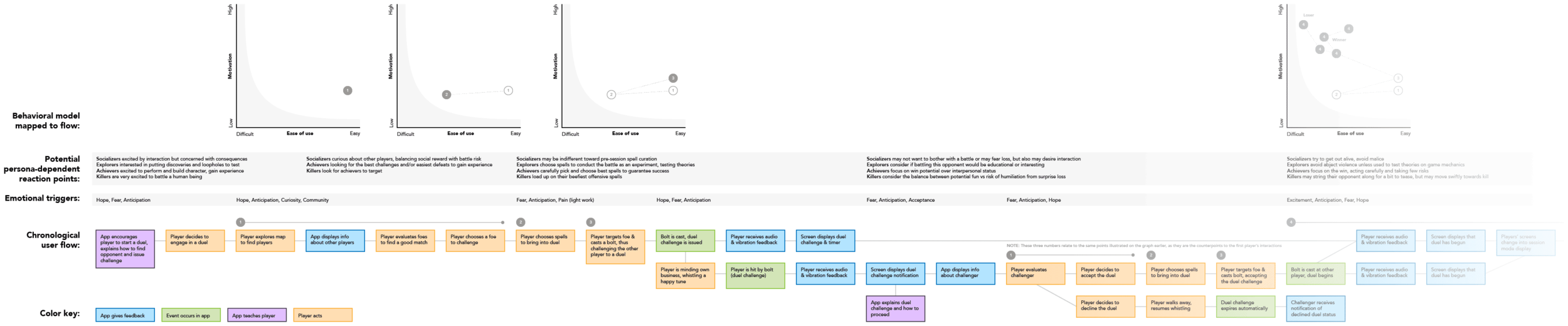
To further define gaming personalities, we looked to Dr. Richard Bartle’s extensive research on the psychology of multiplayer online games. Bartle divides players into four primary characters: Achievers, who seek out prestige, rewards, and character advancement, Explorers, who are defined by their curiosity and desire to discover, Socializers, for whom gameplay is primarily a forum for social interaction, and Killers, highly competitive individuals who take an almost sadistic joy in destroying other players.
As we mapped out user journeys, such as a player’s first battle, we considered each persona’s reactions. How would a Killer respond to an unprovoked attack? Would would more readily approach an unidentified object, Explorers or Socializers? We also utilized BJ Fogg’s behavioral model, graphing each step’s ease against a user’s level of motivation. We frequently revisited this research and modeling throughout the project, tweaking the game’s mechanics and rhythm to ensure an enticing game for all.


Gameplay & user interface
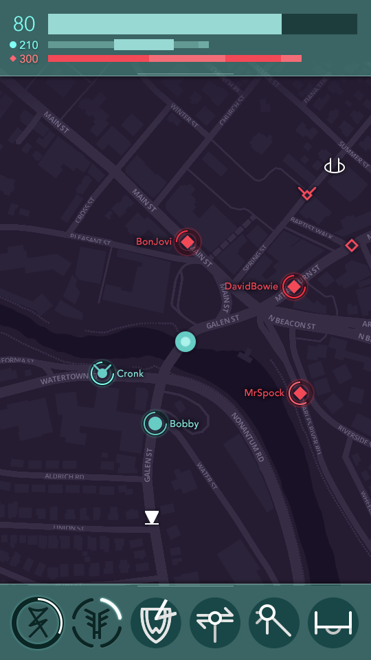
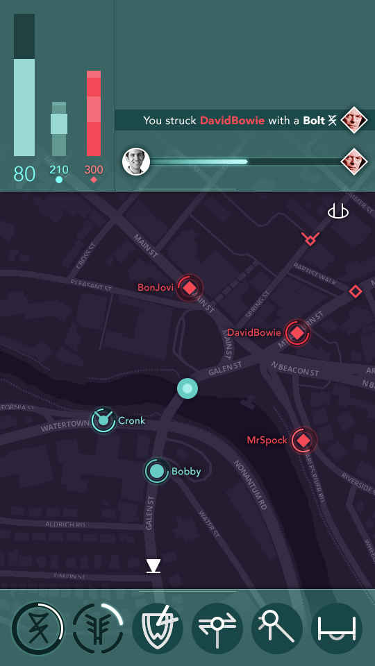
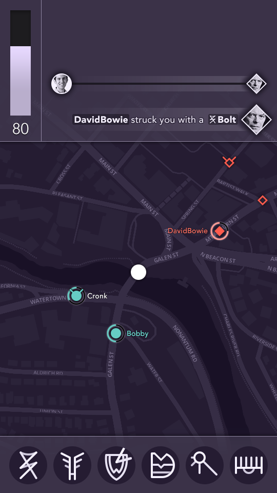
Incantor’s central tenet was to never break the fantasy. This meant keeping players’ attention on their surroundings, not nose deep in their phones. Every aspect of the game served this core principle. To cast spells, the player waves a real wand (powered by Wiimote-like hardware, connected to the phone via bluetooth). The UI was designed to always present information in a quickly glanceable format. To accomplish this, we avoided interface chrome, designed distinct icons, kept interface elements in consistent, predictable positions, favored graphical meters over numbers when possible, and used sound, vibration, and animation to quickly direct the user’s focus.
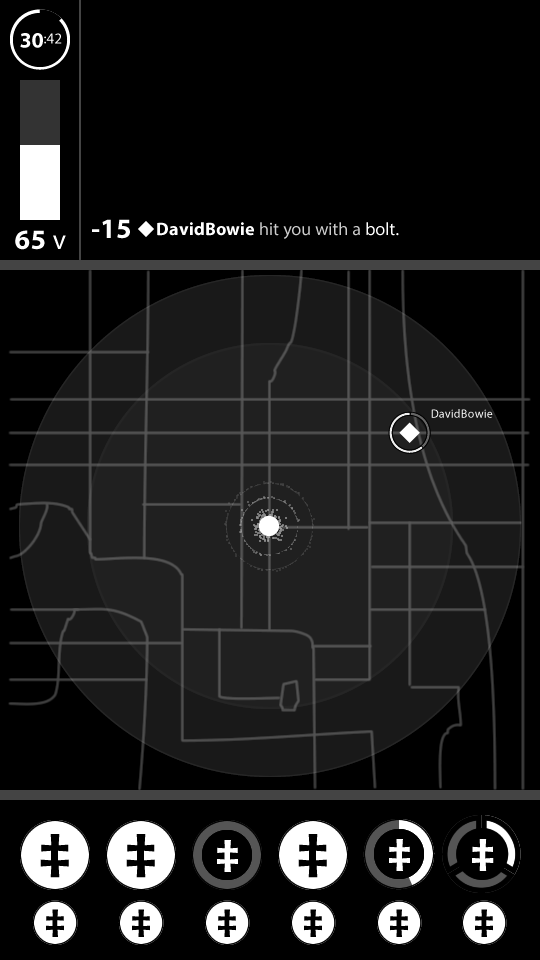
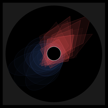
Location played a crucial role in the gameplay, but how to present it was the subject of great debate. We wanted an air of ambiguity, as though the phone’s sensitivity to magic was fuzzy and imprecise. We sketched and prototyped a number of UI concepts with no formal map or geographic cues, only a sort of radar vision. Some versions pulsed or stretched in the general direction of incoming elements. Others depicted all objects and players as part of a great web, interconnected by strands of light and color. Every concept employed some combination of light, color, size, and rhythm to indicate an object’s distance, speed, and relative threat.


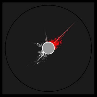

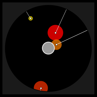
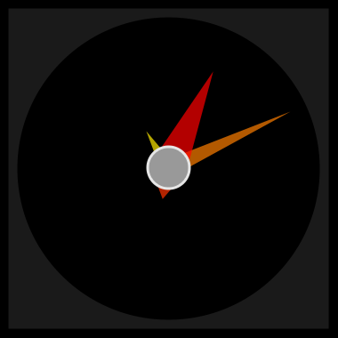


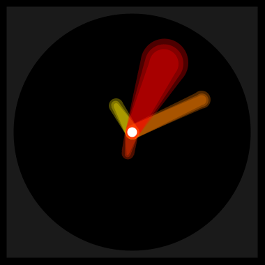
Our final design integrated a true map. Players could navigate the world through a standard smartphone map, but their view of the invisible world of magic would be limited, as though illuminating a cavern with a candle. Faraway objects would be completely invisible. As they approached, the interface would indicate that something was off in the distance. A bit closer and the phone could identify whether the object was friend or foe. Once the object came close enough to fully identity, a battle could be afoot!
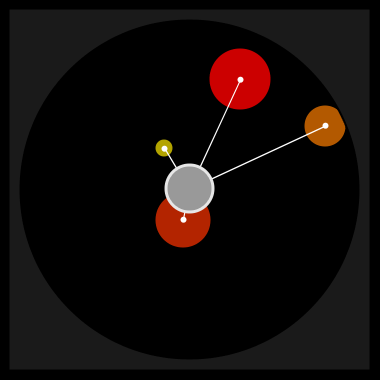
In battle, spells would shoot across the map with bright particle effects, creating trails like falling stars. When a spell hit, the phone and wand would vibrate, sound would crash, and the UI would crackle and flicker, as though overwhelmed by a sudden burst of energy interference. The magic was real.
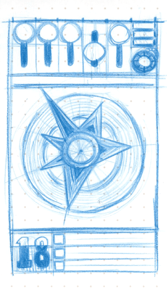
Iconography
With their focus on “mid-core” gamers, the MoveableCode team was adamant to avoid traditional fantasy gaming aesthetic. We avoided the overwrought, macabre, heavily textured aesthetic of World of Warcraft, Dungeons & Dragons, and Diablo.
Instead, we endeavored to create a visual style that felt distinctly modern, but grounded in history. We surmised that were modern humans to discover unexplained forces, they would do as their ancestors had and develop a visual language to record and interpret their experiences. I drew influence from Celtic and Norse mythology, occult symbology, North American hobo sign code, and alchemical pictograms, and developed dozens of icons for the game’s primary spells, its five realms, numerous spell properties, and the many magical items and elements that peppered the map.
Ahead of its time
Incantor is a project I could never forget. It was a wonderful oddball, an ambitious idea that sought to redefine the boundaries of gaming and interactive storytelling. It presented an enormous array of design challenges, and two years later, I still catch myself thinking of new solutions and ideas. Unfortunately, MoveableCode was unable to secure sufficient investment, and Incantor never made it to market. With its focus on seamlessly integrating magic into the player’s surrounding world, the game is perfectly suited like wearables like smart watches and glasses. With such devices on the cusp of mainstream adoption, I honestly believe Incantor was simply ahead of its time.